by C. Elkins, OK Math and Reading Lady
I read an interesting blog post about checking children’s ability to distinguish between letters, words, and sentences. While I always considered that a reading skill related to “concepts of print,” it dawned on me that this relates strongly to a child’s successful writing experience too. This whole concept is what I will explore in today’s post – along with my opinions and ideas about teaching handwriting / penmanship.
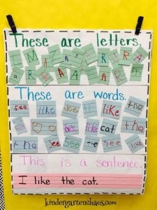 Do you want to see if your students can distinguish between letter, word, and sentence? Try something like this from www.kindergartenchaos.com.
Here are some other links to help your children practice this.
- Letter, Word and Sentence Sort (Free @ TPT)
- Kinderblossoms.blogspot lesson using poem to teach letter vs. word vs. sentence concepts
- Word, letter, or sentence cut-n-paste (free @ TPT)
- Pocket chart concepts of print (free @ TPT)
Using poems on a weekly basis (as with the spider poem in video from #2 above), make it easy to highlight these features (letter, word, sentence) as you continue to practice emphasizing the difference.
So when I want KG or 1st graders to write and I model how to write letters, and put space between these letters and words to write a sentence, they will hopefully have this concept under control. It seems to be pretty common that students aren’t always “seeing” this because they string everything together in one line with no differentiation in spacing between letters and words. Or they confuse letters with numbers.
Another blog I was reading had a great visual that I started trying regarding ways to teach spacing within words and between words when writing. Call it “spaghetti and meatballs.” 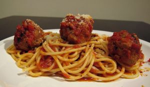 When writing words, the space between the letters (within the word) should be really close (so that a skinny piece of spaghetti will fit in between). When writing a sentence, the space between the words should be the size of a meatball. Placing an uncooked spaghetti strand is a great visual aid! Regarding the meatball, however — I would tell students, “We can’t lay a meatball on our paper, but one or two fingers might work because they are about the same size.” Or if possible, provide a popsicle stick to each student to use as their spacer.
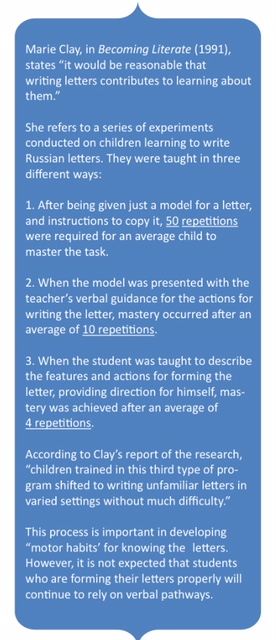 Handwriting instruction is an important component of a complete literacy program. I believe it deserves a strong emphasis, especially in KG-2nd grade classes. Here is an excellent printing and cursive handwriting guide (click for FREE pdf) with plenty of helpful tips, rationale, and research about the importance of emphasizing handwriting. It’s easy to read and really shares my beliefs about how strongly handwriting connects to literacy goals of letter recognition, phonics, and fluency. Toward the end is a page giving verbal cues for letter formation. This research (cited by Reading Recovery’s Marie Clay) was very interesting and supported my strategies mentioned below.
A helpful strategy I have used has been for me to model a letter based on students’ verbal directions. It’s a fun, interactive way (maybe like reverse psychology) to get students to notice the specifics of what you are looking for to make the letter correctly. (I noticed this strategy is supported by Marie Clay’s research – see #3.)
Here’s how this conversation might go for lower case “a” (T = teacher, S = student):
T: Tell me how I should make a lower case a.
S: Make a circle and a stick.
T: OK, here it is — a circle and a stick (illustration a1)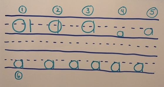
S: No, the stick should be on the circle.
T: Ok, here it is — the stick is on the circle (illustration a2)
S: No, the stick should touch the side of the circle.
T: All right. The stick is touching the side of the circle. (illustration a3) Now how am I doing?
S: It’s good, but it’s too big.
T: OK. Let’s see. Circle and stick (right along side of it), but not too big. (illustration a4)
S: That’s better, but now it’s too small. Make it touch the dotted line.
T: How is it now? Not too big, not too small, and be sure to touch the dotted line. (illustration a5)
S: It has to touch the dotted line and the bottom line.
T: So if I make a circle and stick (right along side of it), and make it touch the dotted line and the bottom line like this, it will be right? (illustration a6).
S: Yes!!!!
Another example with upper case A:
T: How should I make a capital A?
S: Make 2 slanted lines and then go across.
T: How’s this? (illustration A1)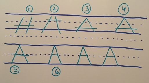
S: No, that looks like an “H.” Make the slanted lines going this way, like a hat.
T: OK, two slanted lines going this way, like a hat. Then I’ll go across. (illustration A2)
S: The lines have to touch at the top. And you have to stop at the bottom line.
T: All right — two slanted lines that touch at the top, and stop at the bottom line. (illustration A3)
S: That’s better, but the letter has to be taller.
T: OK. Now it’s taller. (illustration A4)
S: But now the line going across is too low. Make it go across where the dotted line is.
T: Two slanted lines that connect at the top, touching the top line, and crossing at the dotted line. (illustration A5)
S: Now you made the line going across a little too long.
T: How’s this? Is it right now? (illustration A6)
S: Yeah!!
Then students orally brainstorm words that begin with the letter Aa and we choose some to use in a sentence (along with students in the class whose names begin with the target letter). I model the formation, talk about spacing (spaghetti and meatballs) and then let them have a go. I ask students to circle the A and a they think they formed the best. This shows me they know the criteria and can make it like instructed (or not). I circulate around helping those who need it, praising, giving guidance, etc. Students draw a picture to go with the sentence which gives me time to check on everyone.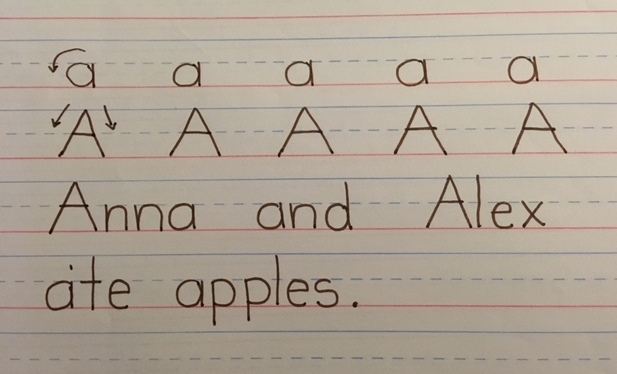
Students are eager for the time when their name appears in the writing. This was a major focus of our writing at the beginning of first grade. Each day, the writing gets better and better as we refine each letter of the alphabet. We notice the 3 sizes of letters: short, tall, and below the line. We noticed the letters that are formed with similar strokes (m, n, r, h for example).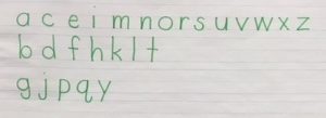
If you don’t have access to dotted paper, then use two spaces for upper case and 1 space for lower case letters. Later in the year when they were ready (usually 3rd quarter), I would move them down to 1 space for upper case and 1/2 space for lower case. I called this “second grade size writing” to let them know they were preparing for the next grade level.
For second grade, I followed a similar process as above (regarding correct letter formation, spacing, etc.). Our sentences were a little more detailed and because their spelling was more advanced, they could help with spelling some of the needed words. Again they loved having their name in the sentence and creating tongue twisters was fun!
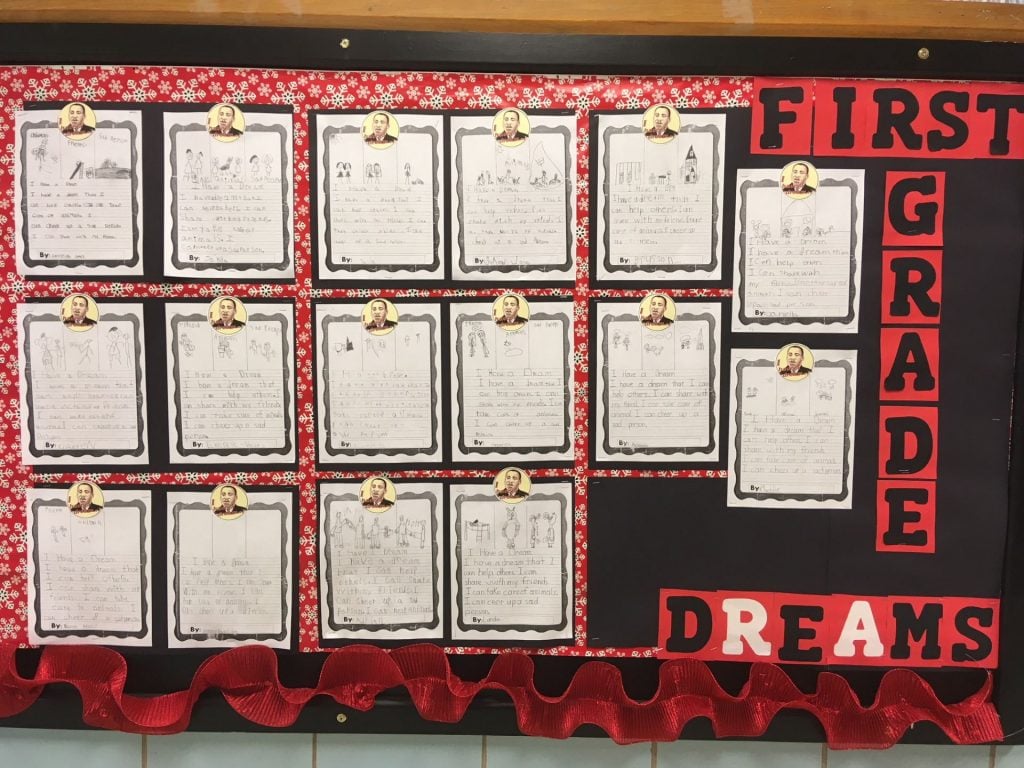 Now I believe when handwriting is not a struggle, you (and your students) will be more willing to tackle writing projects and more proudly display your work. He is a sample of first grade writing where good penmanship has been practiced! Zoom in to see the results! (Thank you, Mrs. Peter’s class at Eisenhower!)
Happy Handwriting!!